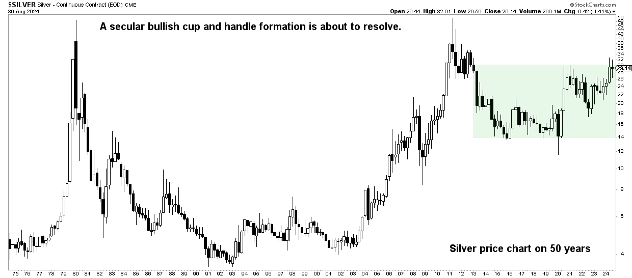
The silver price continues to consolidate within a fairly narrow range of 26.6 – 29.9 USD per Ounce. While many silver investors are getting nervous and checking the silver price every day, they seem to be missing the big picture of silver: the very bullish case on silver’s 50-year chart.
RELATED – Will Silver Ever Reach $50 at a Time? Here you will find the answer and the must-see graphs.
Silver, that famous ‘restless metal’, has a knack for stunning both bulls and bears with its sudden and sharp swings.
But here’s the truth: despite its notorious volatility, silver’s long-term trend playing out on the secular chart is the only thing that should matter to investors.
Let’s analyze it with a top-down approach, looking at the 50-year historical price chart of silver, and then add a secondary indicator in currency (the silver-AUD ratio). No matter how we look at it, our bullish silver forecast remains intact.
Silver price today?
One mental dynamic that most investors can’t deal with (or even recognize) is this:
The more volatile a market or asset, the greater the intuitive need to control its price.
When applied to silver, especially on those days when silver moves significantly (up or down), investors tend to get sucked into the short time frame.
What is the price of silver today is the intuitive response. The individual’s emotional system sends a signal to the mind, which then takes control.
This is obviously amplified by social media, where shorter time frames are most popular.
In this illustration we see that the content creator is focusing on the 4-hour chart. While this time frame can be useful, the specific silver charts are created without showing the dominant trendlines and chart patterns from the higher time frames. Not very useful for investment purposes, to say the least.
$SILVER small update.
See also $GDX which is usually a good analog for silver.
NOTE: A move below the recent lows would likely negate the expected upside. pic.twitter.com/eX2Fa4DY5X
– Silver surfer August 30, 2024
Likewise, this illustration lacks the dynamics of the big picture.
$SILVER It looks like we are in a wave (iii) off the lows, we could see a mild to moderate retracement for a wave (iv) before the wave (v) and complete the larger wave 1.
At that point we could see a more substantial pullback for 2 and that’s when the party really gets going imo.
Remark:… pic.twitter.com/mdkApSXhuz
– Silver surfer August 19, 2024
Keep in mind that short-term price movements can be completely irrelevant and meaningless in the grand scheme of things. The silver price Today doesn’t matter and the daily news isn’t relevant either.
The 50-year silver price chart: bullish case for silver
That is why we focus on the dominant patterns.
The secular silver chart, especially the 50 year silver chart, exhibits this one dominant pattern that is difficult to ignore: a classic “secular cup and handle.”
RELATED – Can Silver Prices Rise to USD 100 per Ounce?
This is not just a pattern; it is a mega-sized formation with a long cup (a prolonged price decline) and an equally long handle (a period of consolidation), culminating in what promises to be a powerful breakout.


Over the past fifty years, the price of silver has remained largely flat, with occasional spikes.
But the real takeaway is the pure size and lifespan of this pattern to which ‘the longer the stronger‘applies.
The ratio of silver to AUD
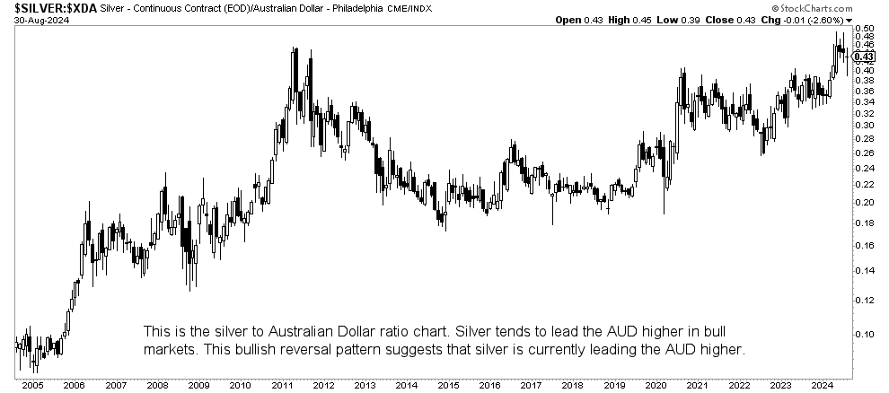
Let’s add some additional analysis to the silver/AUD ratio.
We have described the historical relationship between silver and the AUD ratio in this analysis. Silver is Ridiculously Undervalued **7 Must-See Charts** Published a Few Months Ago.
Historically, silver has tended to push the Australian dollar (AUD) higher due to the AUD’s strong ties to the commodity complex. Currently, the silver/AUD ratio chart is showing a bullish reversal. This suggests that silver is poised for a relative appreciation against the AUD, objectively confirming the bullish secular outlook for silver.
The AUD is consolidating at significant levels, but this bullish ratio reversal signals a potential divergence. If silver starts to outperform the AUD, this could mark the start of a major breakthrough.


Silver is bullish in the long term
In summary, silver’s long-term charts paint a compelling picture.
The 50-year secular cup and handle pattern indicates a significant bullish trend, while the bullish reversal in the silver/AUD ratio further supports this positive outlook.
For investors, it’s clear: keep an eye on both historical patterns and current market signals. Silver’s future looks bright, and the current turmoil is just a harbinger of the big steps ahead.


